
In a recent Data Insight, I wrote about how Argentina was one of the richest countries in the world at the beginning of the 20th century. Today, I want to follow up with a striking comparison between Spain and Argentina.
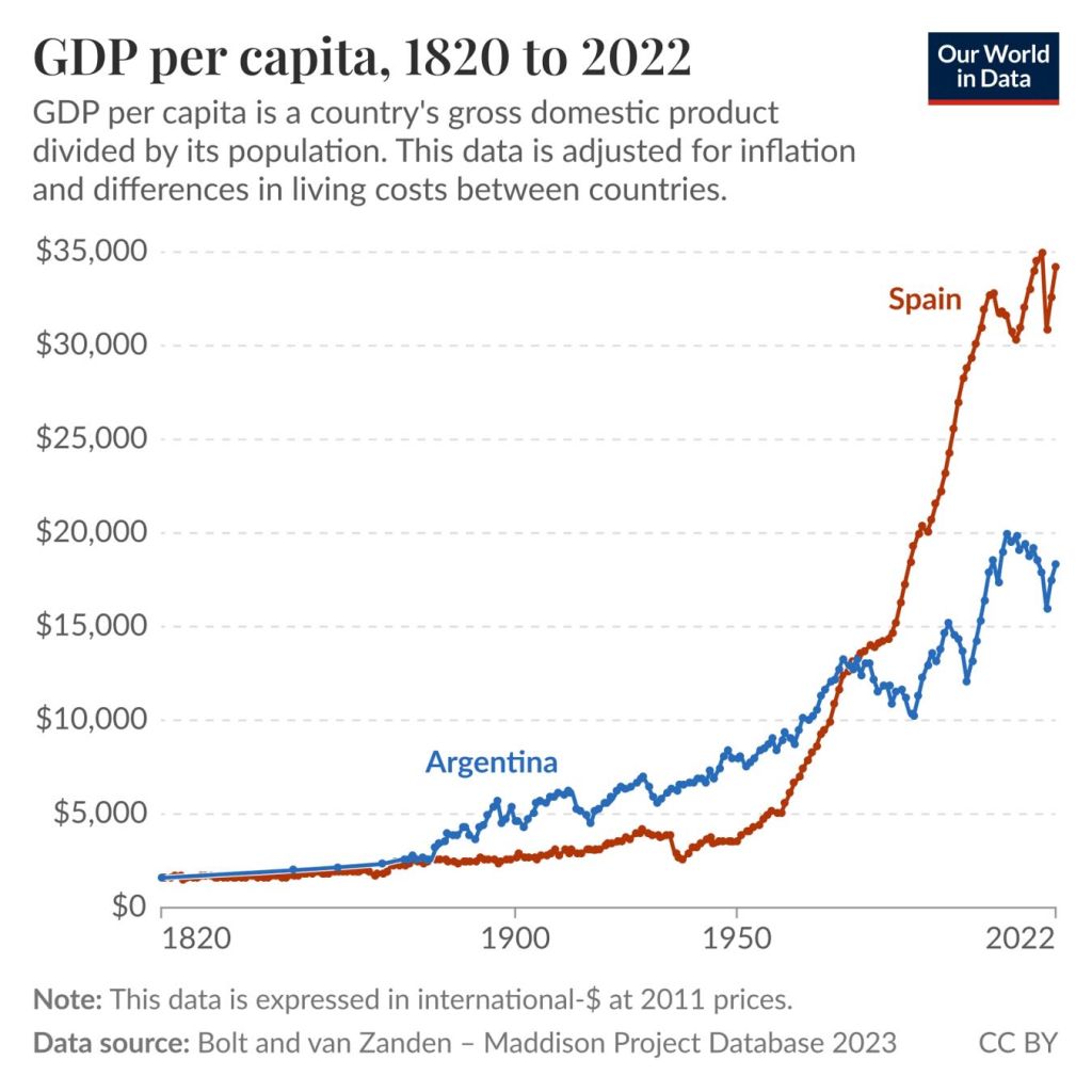
The chart shows GDP per capita for Argentina and Spain over the last two centuries. These are historical estimates from the Maddison Project, and the data is adjusted for inflation and differences in the cost of living.
When Argentina declared independence from Spain in 1816, the two countries had very similar GDP per capita. By the late 19th century, Argentina had become richer than its former colonial power, and it stayed ahead for many decades. Spain then started growing faster in the 1960s, and by the mid-1970s it had caught up.
Continued economic growth in Spain after the 1980s drove the large gap we see today. It kept GDP per capita on a steep upward path into the 21st century. Argentina, by contrast, grew more slowly and went through several economic crises, visible on the chart.
Today, Argentina’s GDP per capita is closer to my home country of Colombia than to Western European countries like Spain. This helps us see how much of a difference economic growth can make within just a few generations.
Explore long-run GDP data for all countries in our interactive chart.By Esteban Ortiz-Ospina

Deja un comentario